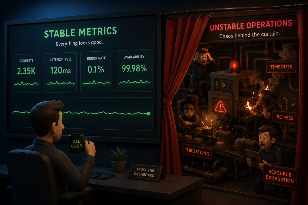
When dashboards look perfect but the ground reality is quietly breaking underneath
Every operations leader loves a green dashboard.
SLA is on track.
Quality looks stable.
Productivity hasn’t dropped.
On paper, everything feels under control.
I’ve experienced this multiple times while managing Trust and Safety operations. You walk into review calls confidently because your numbers look clean. No escalations. No alarming trends. No visible risks.
And then suddenly, something breaks.
Quality drops sharply.
Escalations spike.
Client confidence weakens.
Team morale declines.
The first reaction is always the same:
“What changed?”
But in many cases, nothing actually changed overnight.
The instability was already there. The dashboard simply failed to reveal it.
In Trust and Safety, one of the biggest operational mistakes is assuming stable metrics automatically mean stable operations. Sometimes the opposite is true. The cleaner the dashboard looks, the easier it becomes to ignore the cracks forming underneath.
The Comfort Trap of Stable Metrics
Most moderation teams depend heavily on operational metrics:
- Accuracy scores
- SLA adherence
- Productivity
- Escalation percentages
- Queue aging
- Resolution time
These metrics matter. They help teams scale, track efficiency, and maintain accountability.
But there’s a hidden problem.
Most of these numbers are averages.
And averages are incredibly good at hiding operational instability.
A dashboard can look healthy while specific parts of the operation are quietly deteriorating.
That is where risk begins.
A Real Scenario: “Everything Looks Fine”
In one moderation project I handled, the reporting looked excellent.
- Quality was consistently around 96%
- SLA adherence stayed above 98%
- Escalations were low
- Client feedback remained positive
From a leadership perspective, this was considered a stable operation.
But during an internal audit, we noticed a strange pattern.
A small set of errors kept repeating within one sensitive policy category. Individually, the mistakes looked minor. Nothing severe enough to impact the overall score immediately.
But when we investigated deeper, the pattern became concerning.
The majority of moderators were operating at 98–99% accuracy. However, a smaller group was consistently performing around 85–88%.
More importantly, their mistakes were concentrated in high-risk content categories.
That completely changed the picture.
The overall dashboard still looked healthy because high performers were balancing out weaker performance. The average hid the instability.
This is one of the most dangerous things about operational metrics.
They create a false sense of control.
The Day It Finally Surfaced
A few weeks later, the exact same issue surfaced externally.
Client escalations suddenly increased around that specific policy category.
Now the conversation changed completely.
Nobody cared about the “96% quality score” anymore.
Leadership wanted explanations.
Pressure increased overnight.
Emergency audits began.
From the outside, it looked like quality had suddenly collapsed.
But internally, we already knew the truth.
The issue wasn’t sudden. It had existed for weeks.
The metrics simply averaged it out until the problem became impossible to ignore.
That experience completely changed the way I look at operational reporting.
Why Stable Dashboards Can Be Misleading
1. Averages Hide Concentrated Risk
Averages create smooth-looking reports.
But operational risk is rarely smooth.
It usually concentrates in specific places:
- Certain moderators
- Particular queues
- Sensitive policy categories
- Specific shifts
- New joiners handling edge cases
When strong performance masks weak performance, the operation appears stable even while risk grows underneath.
This is especially dangerous in Trust and Safety because a small number of incorrect decisions can create massive platform impact.
One moderation error in a sensitive category can matter more than hundreds of correct decisions elsewhere.
2. Metrics Rarely Show Distribution
A single quality percentage doesn’t tell you:
- Who is struggling
- Which policies create confusion
- Whether mistakes are increasing in one category
- Whether one shift is carrying hidden risk
Two teams can both report 96% quality while operating very differently underneath.
Team A may have consistent performance across everyone.
Team B may have extreme variation hidden inside the same average.
Without distribution-level visibility, both dashboards look identical.
Operationally, they are not.
3. Most Metrics Are Lagging Indicators
This is another lesson many leaders learn too late.
Most dashboards show past performance.
By the time a metric visibly changes, the underlying issue has often existed for weeks.
Escalations don’t appear immediately.
Burnout doesn’t appear immediately.
Policy confusion doesn’t appear immediately.
The signals start quietly.
But dashboards usually detect damage after it spreads.
Another Scenario: The Silent Burnout Problem
One of the most dangerous operational issues I’ve seen never appeared in SLA or quality reports at all.
The team was still hitting targets:
- Productivity looked stable
- Quality stayed above threshold
- Queue handling remained healthy
Everything seemed normal.
But behavior inside the team had changed.
Moderators became quieter during discussions.
Complex cases took longer.
Participation dropped.
Clarification requests increased.
During one-on-one conversations, the real issue surfaced.
The team was mentally exhausted.
The workload volume hadn’t increased significantly, but the complexity had.
There were:
- More emotionally difficult cases
- More policy ambiguity
- More edge-case decisions
- Higher cognitive fatigue
The dashboard measured output.
It didn’t measure emotional strain.
And because the operation still looked “green,” the early warning signs were ignored.
Within weeks:
- Attrition increased
- Accuracy started dipping
- Escalations followed
Again, leadership described it as a “sudden decline.”
But it wasn’t sudden at all.
The instability had been growing quietly underneath stable metrics.
The Biggest Gap in Operations
One of the most important lessons I’ve learned in Trust and Safety is this:
Metrics tell you what is happening.
They rarely tell you why.
And sometimes, they fail to show what’s about to happen next.
That gap matters.
Because moderation work is not purely mechanical.
It involves:
- Human judgment
- Emotional resilience
- Policy interpretation
- Contextual decision-making
- Mental fatigue management
A dashboard cannot fully capture those realities.
That’s why relying only on top-level metrics is risky.
Operations usually don’t fail all at once.
They fail gradually, unevenly, and quietly.
What I Changed After These Experiences
After seeing these patterns repeatedly, I stopped trusting “stable” metrics at face value.
Instead, I started looking deeper into operational behavior.
Here’s what made the biggest difference.
1. Looking at Distribution Instead of Averages
Instead of asking:
“What is our quality score?”
I started asking:
“How is quality distributed across the team?”
That single shift exposed hidden outliers immediately.
2. Breaking Metrics by Category
Not all moderation mistakes carry equal risk.
A small error increase in low-risk spam content is very different from errors involving violence, self-harm, or child safety.
Category-level analysis revealed risks that overall quality reports completely missed.
3. Tracking Early Warning Signals
Some of the most useful indicators were not formal KPIs at all.
We started monitoring:
- Repeated clarification patterns
- Sudden increases in policy questions
- Participation drops
- Shift-level escalation patterns
- Queue avoidance behavior
These signals often appeared before dashboards changed.
4. Listening More Carefully
Some of the most valuable operational insights never came from reports.
They came from conversations.
Simple comments like:
“This queue is getting confusing.”
“I’m not fully confident with these decisions.”
“These cases are becoming mentally exhausting.”
Those statements matter.
Because humans often detect operational instability before dashboards do.
A Simple Analogy
Think of operations like a building.
Metrics are the paint on the walls.
If the paint looks clean, the structure appears healthy.
But structural damage doesn’t begin on the surface.
Cracks form underneath first.
Pressure builds slowly.
Weak points develop quietly.
And eventually, something breaks.
If leaders only focus on surface-level reporting, they’ll always react too late.
What Leaders Should Really Watch For
If your dashboards always look perfectly stable, that should raise questions, not reduce them.
Ask yourself:
- Are we analyzing averages or distributions?
- Where are errors concentrated?
- Which queues carry the highest hidden risk?
- Are moderators mentally stable or simply meeting targets?
- Are we measuring effort and complexity, or only output?
- When was the last time we challenged our own reporting assumptions?
Because stability without visibility is not operational control.
It’s operational blindness.
Final Thought
In Trust and Safety, hidden instability is dangerous because the consequences spread far beyond metrics.
It affects:
- User safety
- Platform trust
- Moderator well-being
- Client confidence
- Long-term operational health
Stable metrics can provide confidence.
But confidence without deeper visibility can become one of the biggest risks in operations.
Because the most dangerous problems are rarely the visible ones.
They are the problems your dashboard is quietly averaging out.